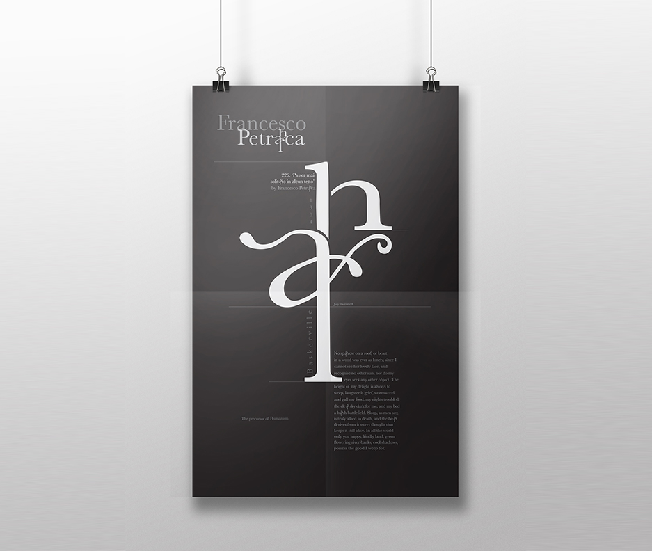
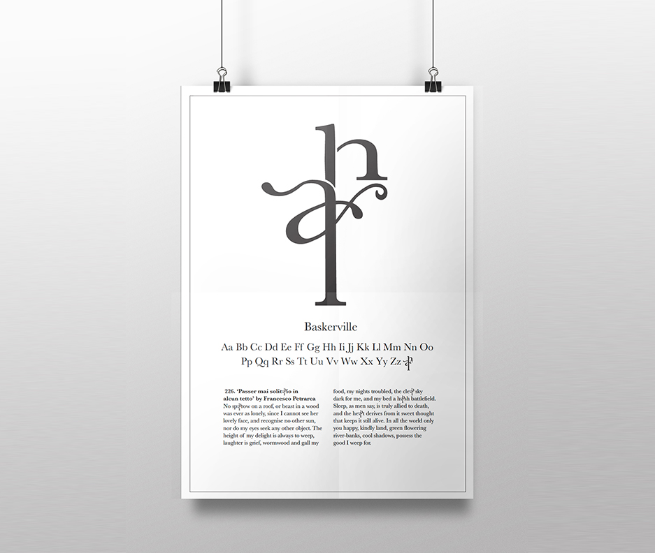
During my study abroad experience, we were tasked with observing the nuances of letterforms to design an illuminated or 27th letter, intended to introduce a historical Italian text.
My focus was Francesco Petrarca, a Renaissance-era Italian poet renowned as one of the earliest humanists. Deeply moved by his work, I immersed myself in his poetry, ultimately selecting four of his most compelling pieces for in-depth analysis.
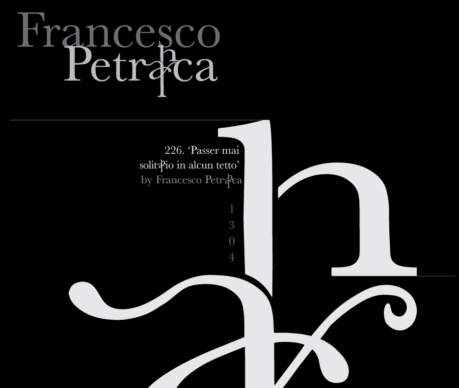
I meticulously examined each poem, identifying the most frequent letter combinations. The pairings AR, ES, and AN emerged as predominant. After extensive sketching and exploration, the AR combination proved most inspiring for the ligature I envisioned. I selected an excerpt from Petrarca’s poetry that particularly resonated with me for its elegance and tone.
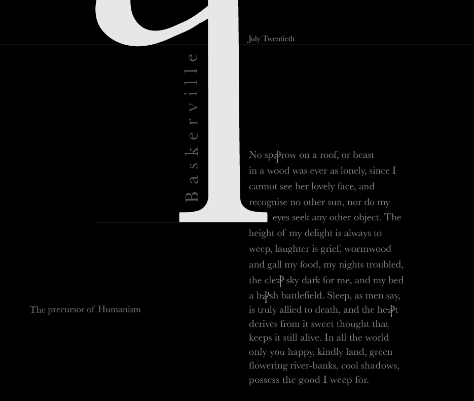
To contextualize my 27th letter, I chose three serif typefaces from the Old Style, Transitional, Modern, Egyptian, and Contemporary classifications. Ultimately, Baskerville was selected to showcase my creation. I developed both digital and hand-drawn sketches of my illuminated letter designs.
For the final poster, I aimed to make the new letter the focal point. I experimented with tints and shades of white and black, reflecting the poem’s tone. As per the project requirements, I incorporated my 27th letter at least five times within the chosen text.
This project deepened my understanding of how letterforms harmonize to create a cohesive piece. It also underscored the importance of iterative design processes and the value of experimentation in achieving a refined final product.
Primary tools utilized: Adobe InDesign, Illustrator, and Photoshop


