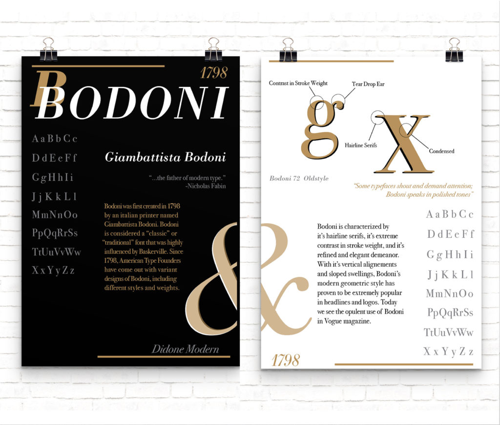
For this project, we were tasked with creating two posters based on a single researched font. The posters were required to function cohesively when displayed side-by-side, as well as stand alone effectively. The challenge lay in decorating the posters using only typography, without any imagery, while incorporating the full alphabet. I chose to focus my design on the Bodoni typeface and its rich history.
After thorough research on Bodoni, I identified its most distinctive characteristics. I then sketched numerous rough layouts to explore grid options, information hierarchy, and the strategic use of negative space. Bodoni’s classic and timeless qualities inspired my design approach. To reflect this timeless elegance, I settled on a refined three-color palette of black, white, and gold for both posters.
This project was a valuable learning experience. It deepened my understanding of color psychology and emotional impact, the importance of hierarchical design, effective use of negative space, grid systems, and the critical role of readability in design.
Primary tools utilized: Adobe InDesign and Illustrator


